On AI, Versioning, and the Alphabet
Curated by Ryan Kuo and Viktor Timofeev, One to Zero reverses the tech-startup concept of monetizing the future by going “zero to one” as a way to explore the contradiction of making and sharing digital artwork today. Below, several of the artists featured in the exhibition — including Mira Dayal, Ryan Kuo, Dirk Paesmans, Adriana Ramić, Laurel Schwulst, and Viktor Timofeev — use a Q&A format to reflect on how the show came together and the complexities of AI, versioning, and the alphabet.
Q: How does your piece for One to Zero fit into your larger body of work? Is it autonomous, or part of an ongoing exploration?
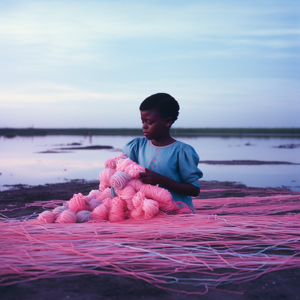
Laura Brown: Much of my work reflects on the technical constraints, standards, and systems inherent to ways of seeing, representing, or encoding information. Sometimes this interest manifests in the form of software pieces created entirely on the computer. However, for this project I wanted to get out of the computer-based realm and work with physical materials—and then bring them back into the digital space. In Mon Alphabet en Signes (2024), there is not a single technical-computational process being pointed to—although the piece does rely on AI-generated image analysis, text generation, and text-to-speech. Rather, the piece deals with the very human systems of language, its acquisition, representation, symbolic convention, reference, and interpretation—all of which are now detected or emulated by computers with points of strength and weakness that are different from our own.
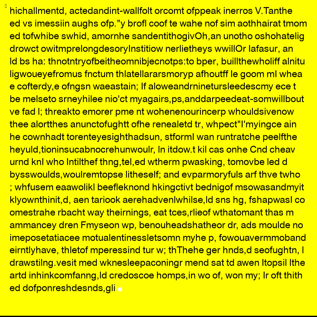
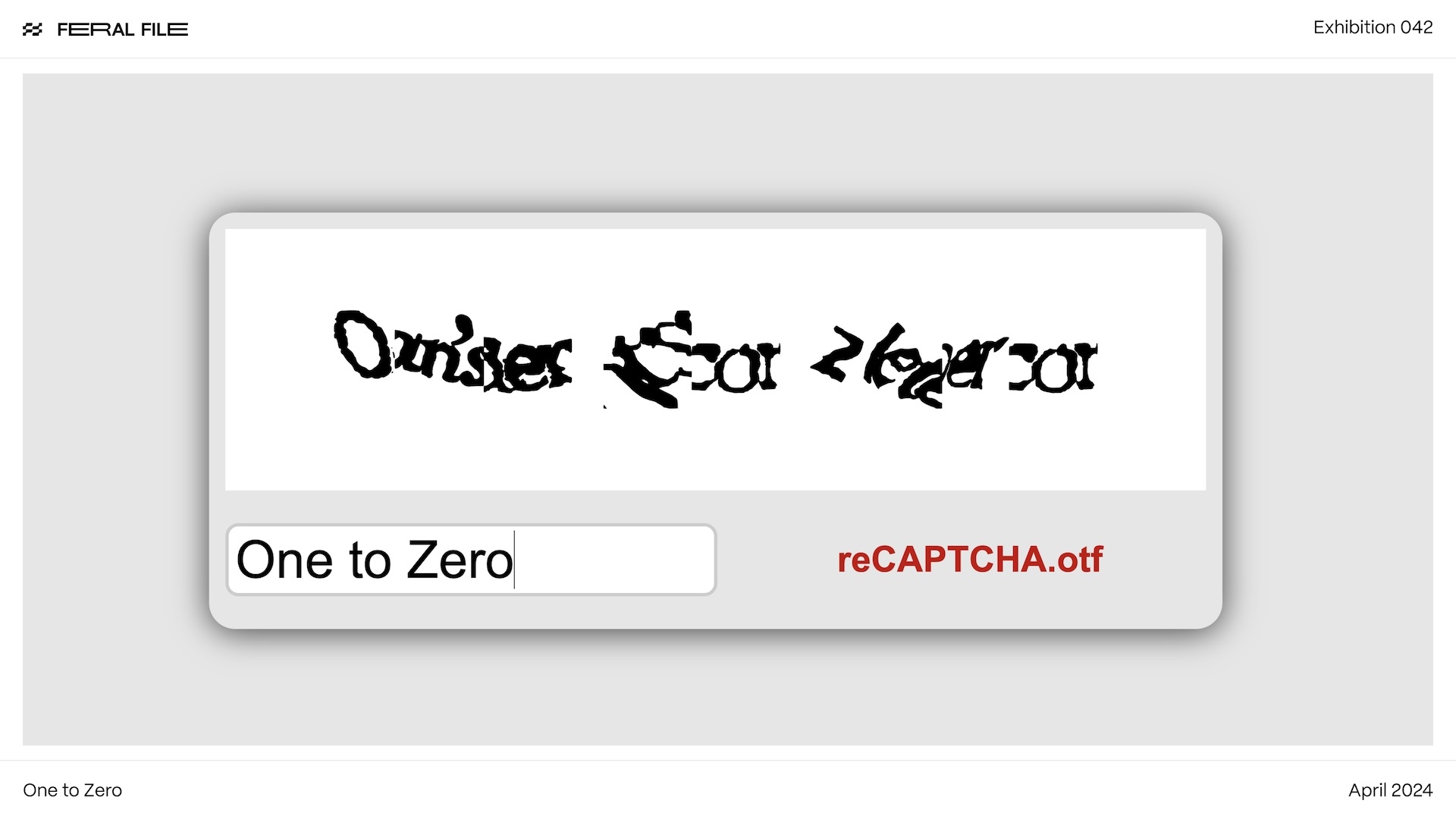
Mira Dayal: reCAPTCHA.otf (2024) is an extension of an ongoing body of work about language technologies. I’ve long been interested in themes of translation, encryption, and illegibility, but this piece is most directly anchored in an abecedary of ink-on-paper drawings I’ve made since 2020 of reCAPTCHA texts. That series has been shown at Artspace New Haven and Spencer Brownstone Gallery in the past few years, and is currently on view at Princeton University’s Bernstein Gallery in an exhibition titled Complex Tokens. For that exhibition, I also created sets of sculptural works that merge the ancient origins of written language with the more contemporary authorizing system of reCAPTCHA texts, and the developing systems behind Large Language Models. For Feral File, I pushed this body of work into the functional realm by making an OpenType Font from scans of my drawings.
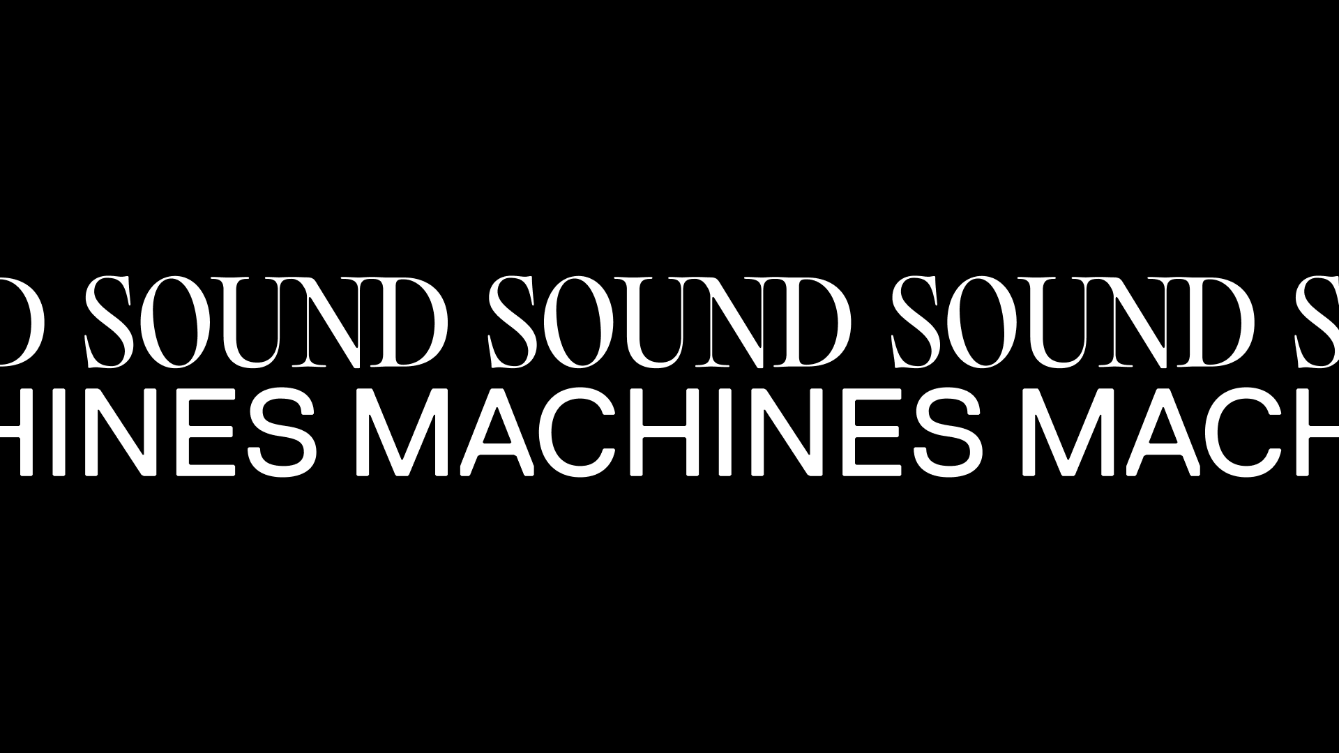
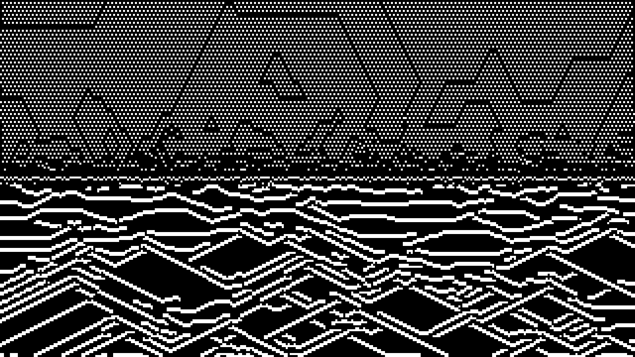
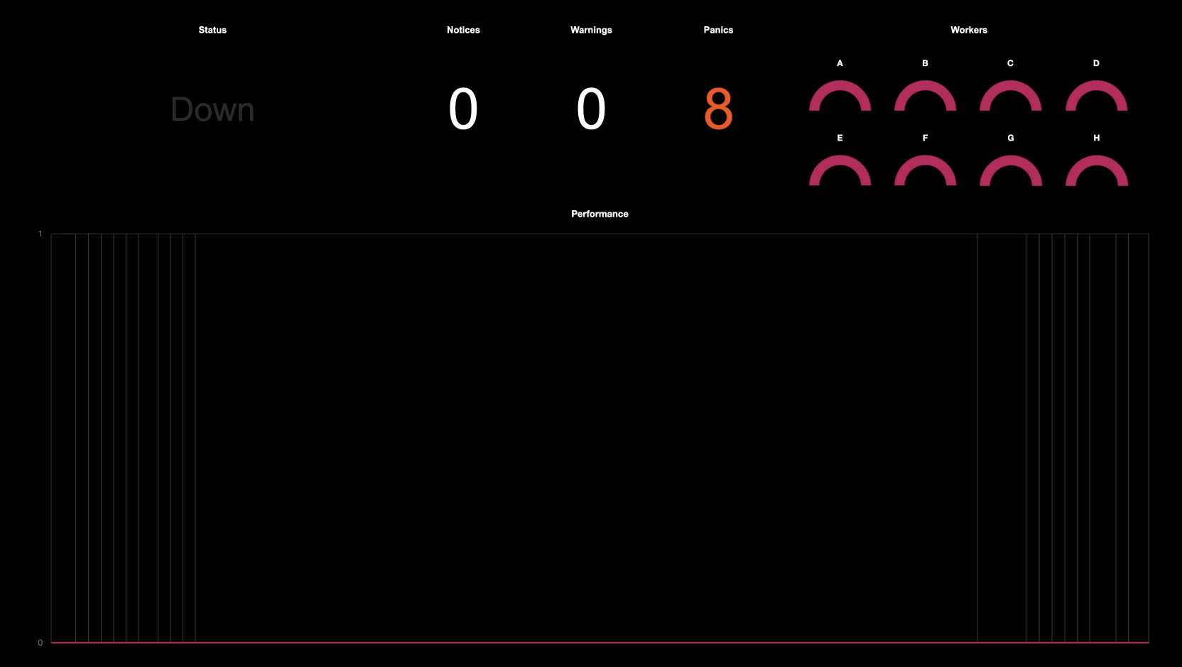
Ryan Kuo: Downtime (2024) is a new idea, but it resembles my other work in that it’s a system that argues with itself. It does mark a return to my interest in audio, which in recent years has mostly been limited to designing blips and bloops for my artworks, which tend to look like user interfaces. Downtime began as an audio piece. Behind the visual layer is a Max/MSP program that continuously manipulates eight samples according to its own logic, which I’ve been fine-tuning for a while. The samples were selected from over a hundred sound files that I made for my M+ commission, Puzzle, but which weren’t ultimately used.
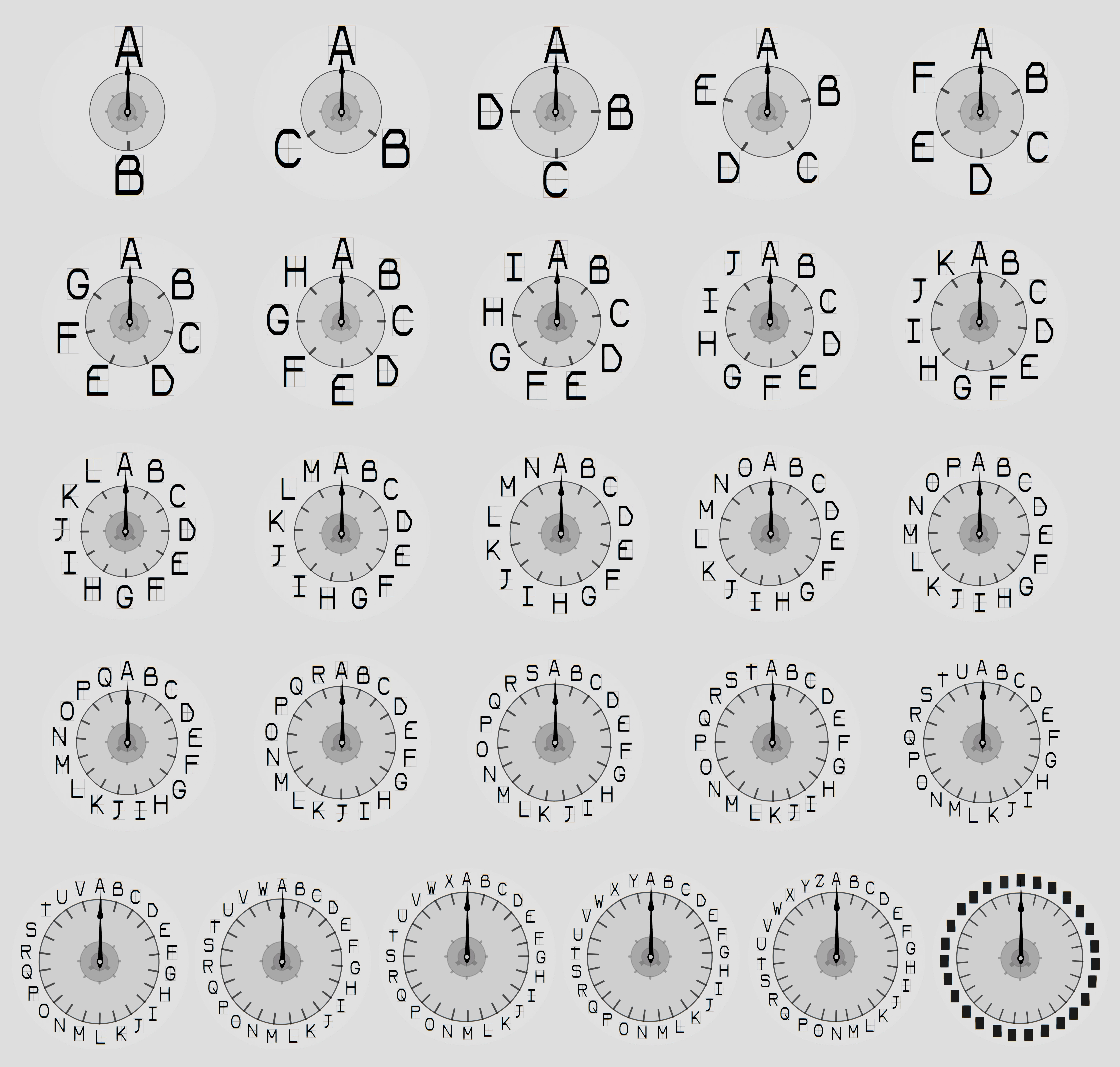
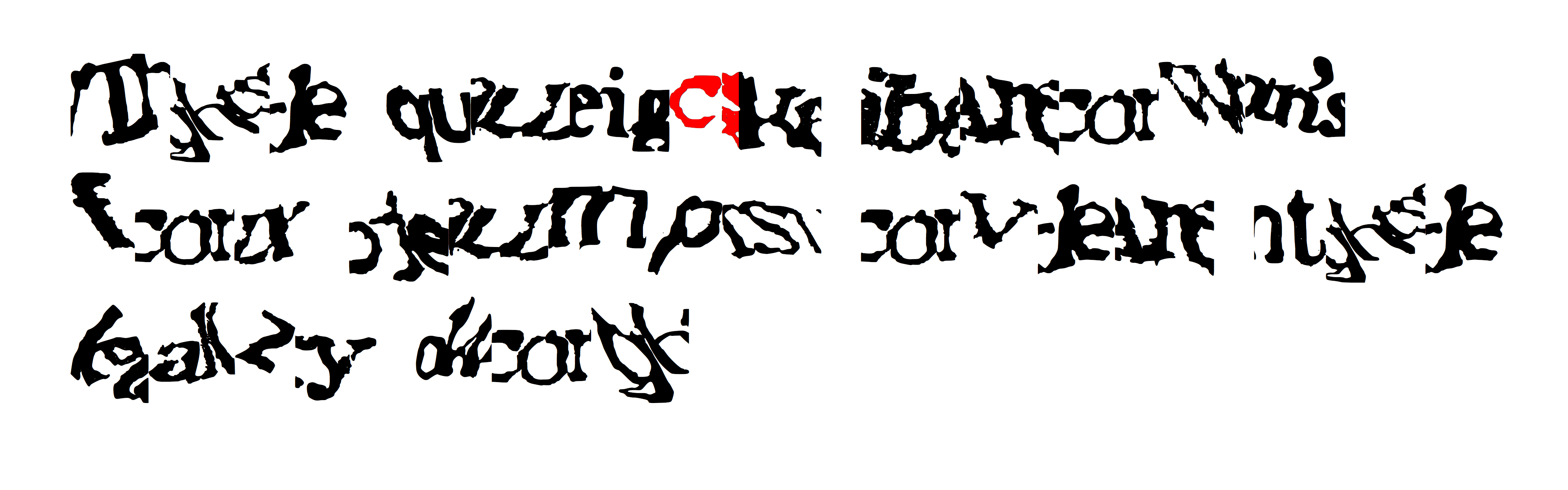
Viktor Timofeev: Human Abecedary: Interletters (2024) is the second part of a series related to scrambling the alphabet. This version focuses on the many possible mutated glyphs that form as a result of scrambling a growing pool of letters. I think of this work as an offshoot of a much larger project.
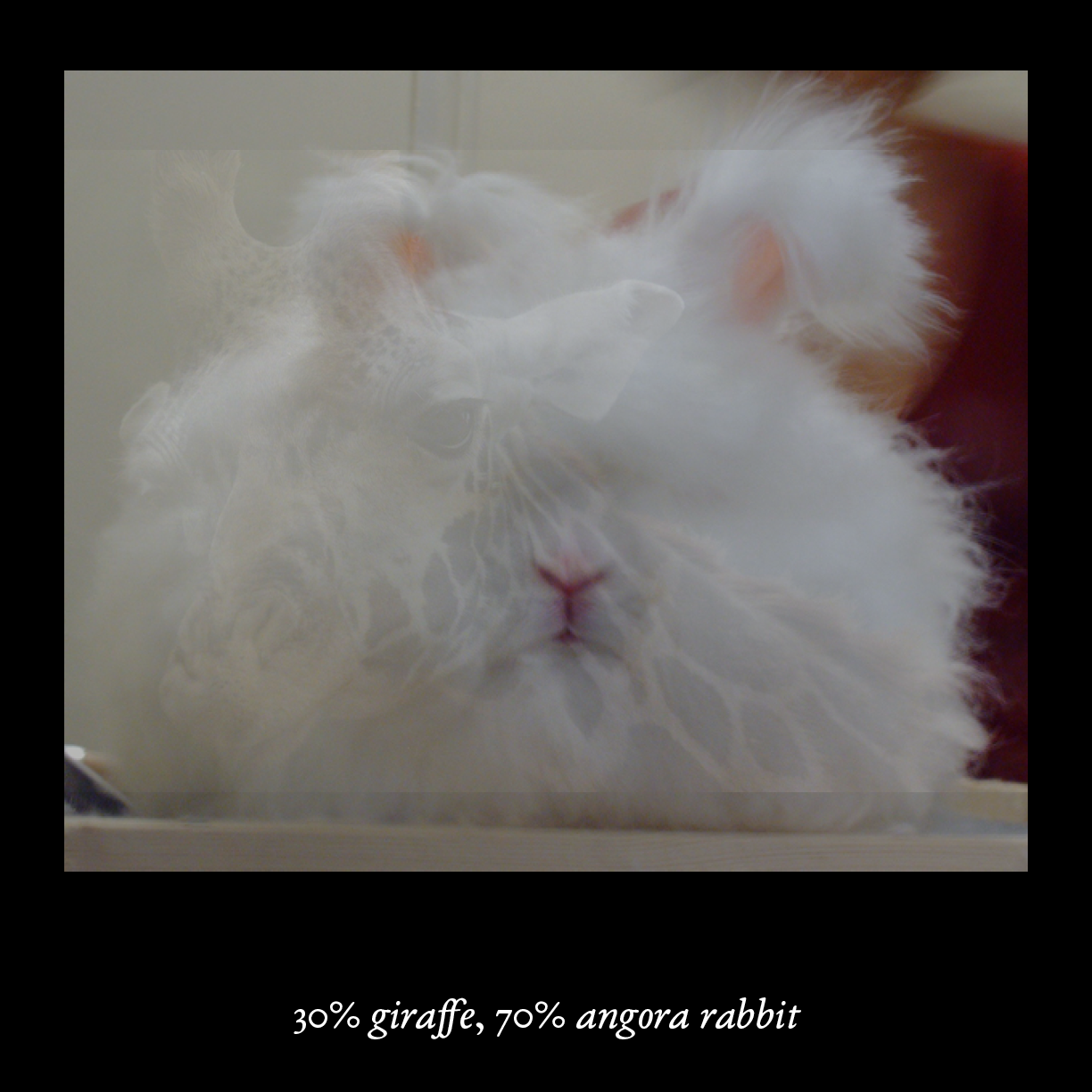
Adriana Ramić: Memory Intensified by Hand of Manual World (2024) is a programmatic recreation of an earlier work from 2021. Initially presented as a two-channel video installation, with facing projections of animal/object pairs manually overlaid in varying opacities, I rewrote the piece for individual computer viewing as a desktop application to display endlessly recombinant sequences of opacity chimeras.
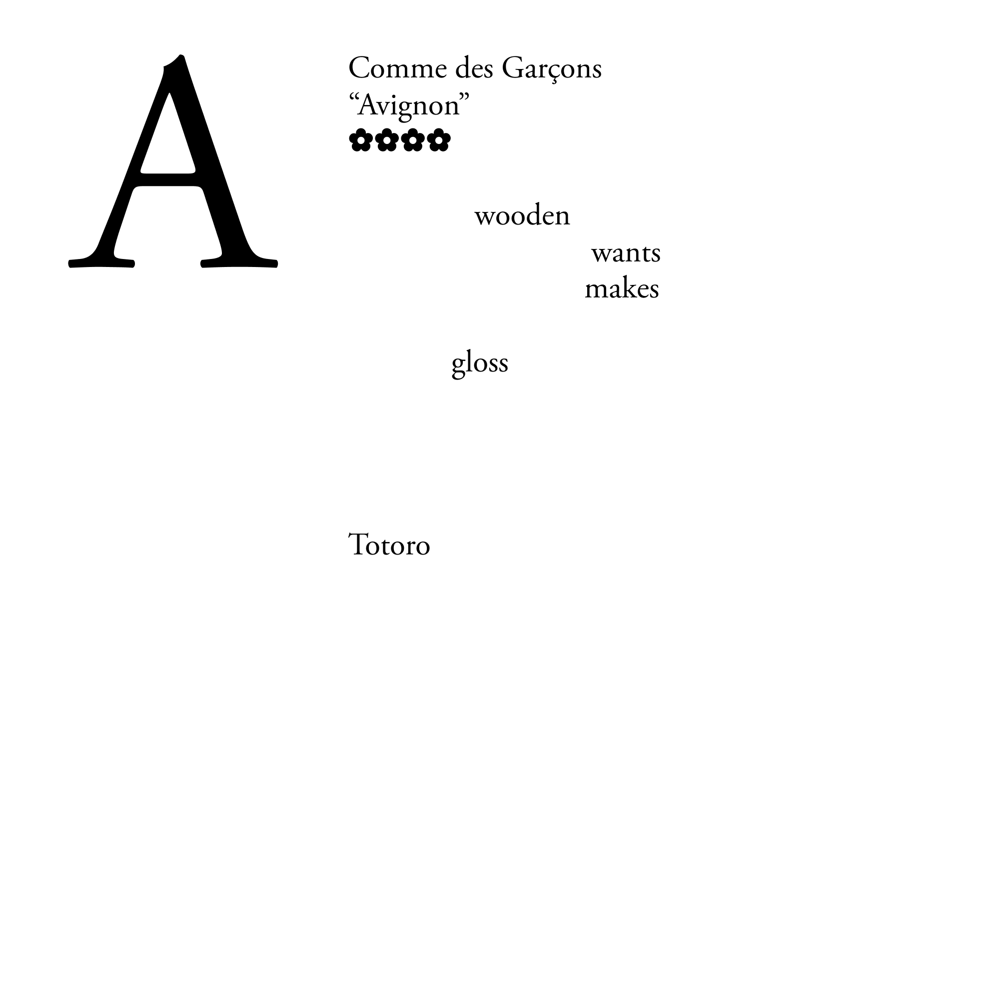
Laurel Schwulst: As Perfume Area, Sydney Shen and I have published a book of our reviews that was divided into the sections “Morning,” “Afternoon,” “Evening,” and “Night.” We don’t explicitly say what these sections mean in the book, but you could consider them as times of day recommended for wearing the fragrances within. These sections also gesture towards perfumes as narrative elements over the course of a single day, and the Perfume Area book as a work of fiction. In our new work for Feral File, Perfume Area: The Alphabet (2024), we use the web as a medium to present “living” reviews that change according to the time of day. The reviews are most full during the time of day when they feel most at home. I was especially excited to involve Sydney Shen and Perfume Area for this project because of how animated I feel every time I return to scent in general. I feel scent, memory, and places are the last frontiers which technology and AI can’t touch, and so I like to celebrate and spend time in them.
Q: What role did the system of editioning play in conceiving your work for One to Zero?
Dirk Paesmans:
"".!!?a Crypto Wallet to browse online art’^constructed as NFT%,
‘; **** #Yahoo! accountancy "\ qw e
/Chase000.ZeROxburnETH.wpCAncelled_TransAction -ues INfornA
/oClp_Collct CJha IPFS044
/92580 0-0 -021-0-0124 -0-0——4
[sic]
Laura Brown: The edition size of 26 prompted a choice between making a kind of abecedarium — which necessarily comprises exactly 26 pieces corresponding to the letters of the alphabet — or something which could have any number of variations, but which happens to be distributed in an edition of 26. I chose the former. I wanted each distribution in the series to be unique, rather than a variant of a single work distributed 26 times. So, each piece in the series is a unique work and the total series of 26 creates a larger work, too. Choices in how the work may be represented online and packaged for download are also occasions for reflection on what exactly constitutes “the work,” when that work consists of images and texts in the abstract that may be represented in different formats and combinations.
Mira Dayal: The edition size of 26 was a logical extension of this project because I had already been working with the form of the abecedary, and there are 26 letters in the English alphabet, which means my font also had to have at least 26 characters. I often work with constraints of some kind in my practice. In this case, the form of the abecedary is conceptually useful, as it gets at the pedagogical relationship between humans and computers that is at play with the reCAPTCHA system. During one phase of reCAPTCHA, the distorted words were taken from scans of books that Google’s machine readers hadn’t been able to transcribe. Because the words were hard for computers to read, the system worked to prevent bots from passing the test. But by transcribing the reCAPTCHAs, humans were also helping computers learn what those words were—and this would later mean that the computers had access to fully transcribed texts. This kind of relationship continues today; for example, humans continue to process language for the purpose of training Large Language Models.
Ryan Kuo: In my work, I always make one big system that I refuse to break down to make consumable. In this case, the need to parcel out the work was a great excuse to pull out individual threads. Downtime (2024) is primarily an audio generator that you “monitor” in a web browser, but it’s also a series of 26 short looping videos that isolate the layers of the composition. In each video, one of the “workers” (the eight audio samples) runs through one of its “downtime” states and demonstrates what that sounds like. The videos do a lot to clarify all the shapes that go into this composition, and in some cases express more with less.
Viktor Timofeev: Having 26 works in the series as a constraint allowed me to add a single letter to the growing pool of letters with each work, starting with just A and B, and ending with A through Z. As the “wildcard” in the series, the 26th work includes a censored letter — a black square — that slowly infects all of the letters, transforming them beyond recognition.
Laurel Schwulst: Editioning felt related to compiling a book, at least for me. It also made me think this work could easily be extended into the future in other editions, like Perfume Area: Chess, or Perfume Area: Kiki Bouba, or Perfume Area: Zodiac, or essentially any other way of mapping our reviews onto existing symbolic sets.
Q: How did the process of making the work pan out compared to how you thought it would when you set out to make it?
Laura Brown: A few years ago, I started experimenting with making images using a flatbed scanner in unintended ways. For One to Zero, I initially wanted to continue in that vein, but came across this set of alphabet tiles by chance at a flea market. In the end the method of image capture in the piece became unimportant. What became interesting to me, as I started to try out different things with the tiles, was how an AI tool trained for image analysis described them.
The computer’s confusion of the multiple levels of representation and reference operating simultaneously in the images made those distinct levels more apparent to me. The AI seemed to ask, “Are we trying to describe a digital image with a significant black background, the wooden tile itself, the image and text on that tile, or all of the above?” Even to a human, it is less straightforward than it might at first seem to answer the question, “What is this an image of?” The AI tool provided a prompt to ask further questions about the image, so I began asking things like, “What does this image mean,” and “What is the signification of the image?” Some of its responses made their way into the texts of the final piece.
I found it interesting that the AI attempted not only to describe the images in terms of their formal qualities or literal representational content, but also to speculate about the cultural or social significance of the artifacts. In doing so, it rarely recognized the pedagogical function of the artifacts depicted (to aid children in learning the rules of language) and instead seemed eager to describe the digital image or the tile contained therein as an artwork.
Mira Dayal: reCAPTCHA texts are often skewed and morphed such that the letters bleed together and curve around each other; they don’t always share a standard baseline. These formal distortions are what make them difficult for computers and bots to transcribe, so that they can function as a security measure to verify humanity. Following that logic, instead of cleanly editing the scans of my reCAPTCHA drawings to isolate individual recognizable characters for the font as I had initially intended, I decided to edit the scans so that each character in the font also includes peripheral information—for example, stray lines and marks—from neighboring characters. This means that as you type, the letters veer off and conjoin in unexpected ways. And because the font also includes variants for each character, taken from different reCAPTCHA text drawings, the letters scramble as you write, further encrypting what you type. These behaviors feel true to actual reCAPTCHAs.
Laurel Schwulst: Compiling all the time-sensitive reviews into one page with an was exciting. We weren’t planning on doing this originally, but after we did it, it made me wonder why all images and texts aren’t time-sensitive.
Q: What roles do language and humor play in your work?
Laura Brown: Recently I’ve been reading about semiotics and its relation to cybernetics and psychoanalysis, and I’d like to continue in this direction. Looking at these alphabet tiles, I first thought about explanatory diagrams of Swiss linguist Ferdinand de Saussure’s conception of a sign, consisting of a signifier (an utterable word) and signified (the concept it represents). Visual representations of the nonvisual dyad typically show a written word, sometimes in quotes, and a picture of the idea it signifies.
It was later pointed out to me by Damon Zucconi, who also has work in One to Zero, that the tiles, with their sans-serif font, look a bit like John Baldesari’s image-with-text works. This is one little art-historical nod that I suppose can be read into the piece. I then wanted the subtitles of the voiceovers to add additional characters through typography, infusing a bit of playfulness. The male voice is accompanied by a serif font suitable for print, similar to the font used in older editions of Saussure’s Cours de linguistique générale; the female voice is accompanied by a handwritten font referring to a certain Belgian artist whose identity and relevance I hope the viewer can arrive at on their own.
Humor has never played much of a role in my work, but I like the idea that art can be funny or playful—and much of the work that I like is. The texts generated in this project are often funny due to their incongruity in tone and content with the actual objects they describe. I think this is all the more the case when they are orated by voices that evoke the voiceover of a documentary or museum audio guide.
Mira Dayal: Language is central to a lot of my work. Sometimes the etymology or double meaning of a word, or other language play, will give rise to an idea for a piece. In other cases, a work’s material or composition will refer to forms and histories of written language.
With reCAPTCHA.otf (2024), a functional font, I have made a tool for language; a vehicle through which one can write. And the style of this tool refers to a system that depends on the ambiguity between a word and an image. There’s already a history of people making fake reCAPTCHA texts that function as jokes, or sharing images of particularly amusing juxtapositions of reCAPTCHA texts. Typing with reCAPTCHA.otf is also funny—in the sense that it can be frustrating and surprising and strange and amusing and not at all what you intended. In general, I enjoy making work that reads as conceptually tight, critical, responsive, and serious, but that also feels materially excessive, absurd, enigmatic, and playful.
Viktor Timofeev: I think about language a lot, particularly as it relates to national identity and a sense of belonging, or lack thereof. For example, Russian is one of my primary languages, though I am from Latvia. This language belongs to a country that no longer exists, spread across borders and left behind as a product of imperialism. However, I continue to speak it, as it is part of my selfhood. This has created a constant balancing act in my head, as I shift between different versions of myself—each with a different tone, vocabulary, and personality.
Adriana Ramić: My works often start with and become language—whether composed by myself, found, generated, or a combination thereof. I am interested in it as a means of codifying perception and suggesting the ineffable. It's also a very immediate, low-fidelity medium. Here the phrasing of each %-indexed pair suggests an endless incompletion of being and reconfiguration of understanding, but in a very simplified language of classifications.
In using categories drawn from image recognition classification databases like ImageNet, I'm interested in the language parameters used in training these systems, and what is within and without the world they suggest. To me, the piece is both humorous and melancholic: there is an immediate dumbness of overlaying varying opacities that ignores the sophistication of today's image-editing possibilities.
Laurel Schwulst: Language and humor play significant roles in the work. Each review is what we call a “prose pocket world,” lyrical and written in second person, like a tour through an imagined landscape. In 2015, we adapted the reviews posted on our website perfume-area.com into a book. The book features a pull-out map that plots every place recalled throughout the fragrance reviews. In a review of Perfume Area, critic Lucy Chinen reflected, “This additional (map) element made me think about how fragrances can be understood spatially. Where exactly is perfume area anyway, is it inhabitable and how can we get there?”
Q: Now that you’ve seen the other works in the show, are there any surprising alignments or resonances you have noticed?
Mira Dayal: It’s great to see other interpretations of the alphabet, and I also appreciated Adriana Ramić’s series that seems to deal with machine vision and how computers label images—which is very much related to the technologies I have been studying.
Ryan Kuo: I’m inspired by all of the works in the show, especially as I’ve followed their development for months (as one of the exhibition’s curators). Dirk’s PURCHASE CANCELLED (2024) series, which captures the feedback loops created by the Feral File interface stopping him whenever he wouldn’t connect a wallet, resonates more and more strongly as we continue to finish installing this show. It demonstrates that disconnecting from an interface can be as meaningful as engaging with one, and I will have this tension in mind when our exhibition closes.